Estimating Fate Probabilities and Driver Genes
Preliminaries
In this tutorial, you will learn how to:
compute and visualize
fate probabilitiestowardsterminal states.aggregate fate probabilitiesover groups of cells to uncover fate-biased populations.correlate fate probabilities with gene expression to detect putative
driver genesof fate decisions.
This tutorial notebook can be downloaded using the following link.

Quantifying cellular fate bias with absorption probabilities: For each cell that is not assigned to a terminal state, we estimate its fate probabilities of reaching any terminal state. To compute fate probabilities, we consider random walks, starting from the query cell, and count how often these end up in each terminal state. We repeat this many times and use the arrival frequencies in terminal states as fate probabilities. Luckily, we do not actually have to simulate random walks: we use absorption probabilities on the Markov chain, which quantify these arrival frequencies for an infinite number of random walks [Lange et al., 2022].
Note
If you want to run this on your own data, you will need:
a scRNA-seq dataset for which you computed a cell-cell transition matrix using any CellRank
kernel. For each kernel, there exist individual tutorials that teach you how to use them. For example, we have tutorials about using RNA velocity, experimental time points, and pseudotime, among others, to derive cell-cell transition probabilities.
Note
If you encounter any bugs in the code, our if you have suggestions for new features, please open an issue. If you have a general question or something you would like to discuss with us, please post on the scverse discourse.
Import packages & data
%load_ext autoreload
%autoreload 2
import sys

if "google.colab" in sys.modules:
    !pip install -q git+https://github.com/scverse/cellrank
import cellrank as cr
import numpy as np
import scanpy as sc
import session_info2

cr.settings.logging_level = "INFO"
sc.set_figure_params(frameon=False, dpi=100)
import warnings

warnings.simplefilter("ignore", category=UserWarning)
To demonstrate the appproach in this tutorial, we will use a scRNA-seq dataset of pancreas development at embyonic day E15.5 [Bastidas-Ponce et al., 2019]. We used this dataset in our CellRank meets RNA velocity tutorial to compute a cell-cell transition matrix using the VelocityKernel; this tutorial builds on the transition matrix computed there. The dataset including the transition matrix can be conveniently acessed through cellrank.datasets.pancreas [Bastidas-Ponce et al., 2019, Bergen et al., 2020].
adata = cr.datasets.pancreas(kind="preprocessed-kernel")

vk = cr.kernels.VelocityKernel.from_adata(adata, key="T_fwd")
vk
VelocityKernel[n=2531, model='deterministic', similarity='correlation', softmax_scale=4.013]
Note
The method from_adata() allows you to reconstruct a CellRank kernel from an AnnData object. When you use a kernel to compute a transition matrix, this matrix, as well as a few informations about the computation, are written to the underlying anndata.AnnData object upon calling write_to_adata(). This makes it easy to write and read kernels from disk via the associated AnnData object.
Compute terminal states
We need to infer or assign terminal states before we can compute fate probabilities towards them.
See also
To learn more about initial and terminal state identification, see Computing Initial and Terminal States.
g = cr.estimators.GPCCA(vk)
print(g)
GPCCA[kernel=VelocityKernel[n=2531], initial_states=None, terminal_states=None]
Fit the estimator to obtain macrostates and declare terminal_states.
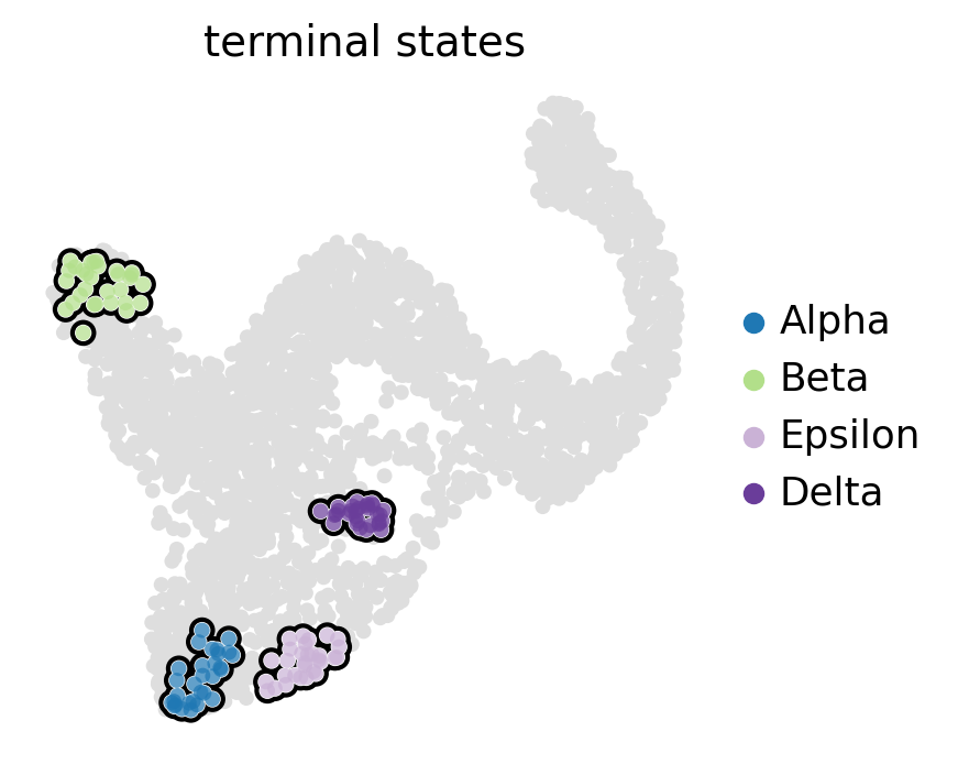
g.compute_macrostates(n_states=11, cluster_key="clusters")

g.set_terminal_states(states=["Alpha", "Beta", "Epsilon", "Delta"])
g.plot_macrostates(which="terminal", legend_loc="right", size=100)
INFO     Computing Schur decomposition
INFO     When computing macrostates, choose a number of states NOT in ``
INFO     Adding `adata.uns['eigendecomposition_fwd']`
                `.schur_vectors`
                `.schur_matrix`
                `.eigendecomposition`
             Finish (0.13s)
INFO     Computing 11 macrostates
INFO     Adding `.macrostates`
                `.macrostates_memberships`
                `.coarse_T`
                `.coarse_initial_distribution
                `.coarse_stationary_distribution`
                `.schur_vectors`
                `.schur_matrix`
                `.eigendecomposition`
             Finish (4.43s)
INFO     Adding `adata.obs['term_states_fwd']`
                `adata.obs['term_states_fwd_probs']`
                `.terminal_states`
                `.terminal_states_probabilities`
                `.terminal_states_memberships
             Finish`
Estimate cellular fate bias
Compute fate probabilities
We compute fate_probabilities by aggregating over all random walks that start in a given cell and end in some terminal population. There exists an analytical solution to this problem called absorption probabilities, their computation is 30x faster in CellRank 2 compared to version 1 and scales to millions of cells.
g.compute_fate_probabilities()
g.plot_fate_probabilities(same_plot=False)
INFO Computing fate probabilities
INFO     Adding `adata.obsm['lineages_fwd']`
                `.fate_probabilities`
             Finish (0.18s)
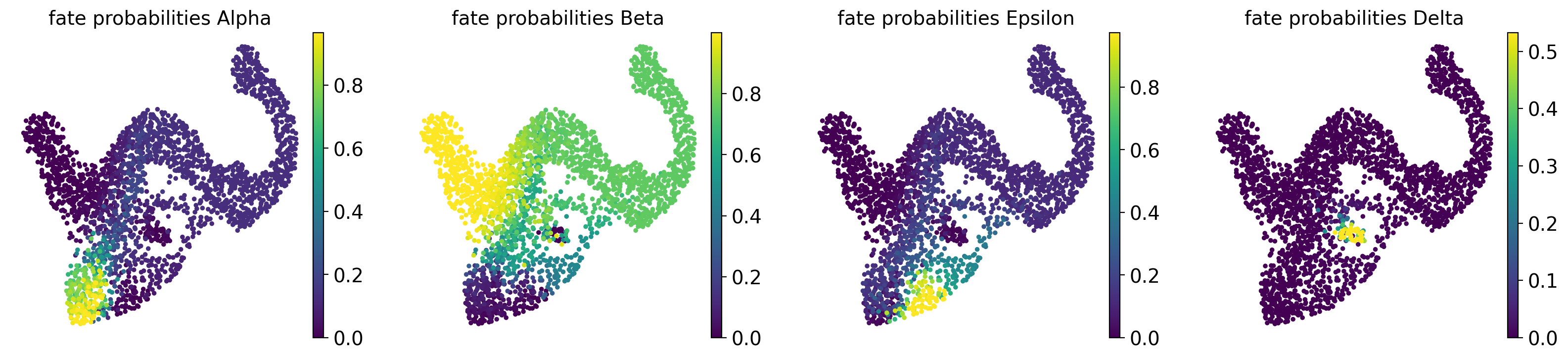
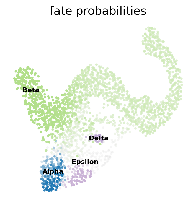
Most cells appear to be fate-biased towards Beta cells, in agreement with known biology for mouse pancreas development at E15.5 [Bastidas-Ponce et al., 2019]. We can visualize these probabilities in compact form by coloring cells according to their most-likely fate, with color intensity reflecting the degree of lineage-bias by using plot_fate_probabilities().
g.plot_fate_probabilities(same_plot=True)
Another compact way to simultanesosly visualize fate probabilities towards several terminal states is via cirular projections [Velten et al., 2017]. In such a plot, we arrange all terminal states around a unit circle and place cells inside this circle, with a position determined by their fate probabilities.
cr.pl.circular_projection(adata, keys=["clusters", "clusters_fine"], legend_loc="right")
INFO Solving TSP for `4` states
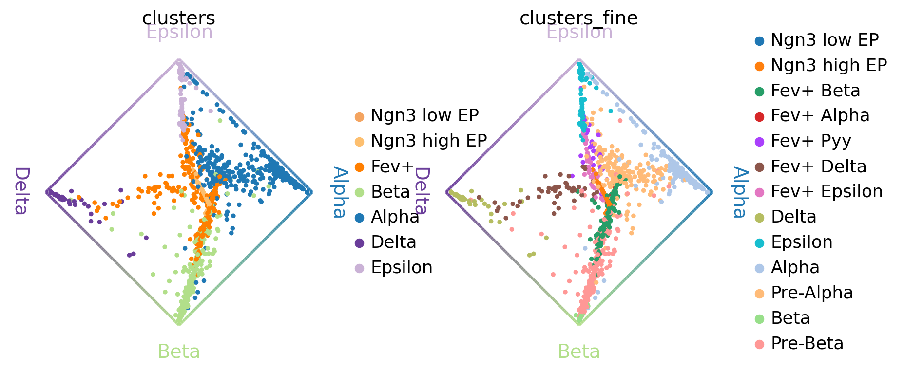
Left plot: As expected, the algorithm placed more commited cells (Alpha, Beta, etc. ) closer to the edges and less commited cells (Ngn3 low EP, Fev+, etc. ) closer to the middle of the circle.
Right plot: Here, we zoom into the Fev+ progenitor population using a subclustering from the original publication [Bastidas-Ponce et al., 2019]. As expected, each Fev+ subpopulation is placed closer to its corresponding terminal state.
Aggregate fate probabilities
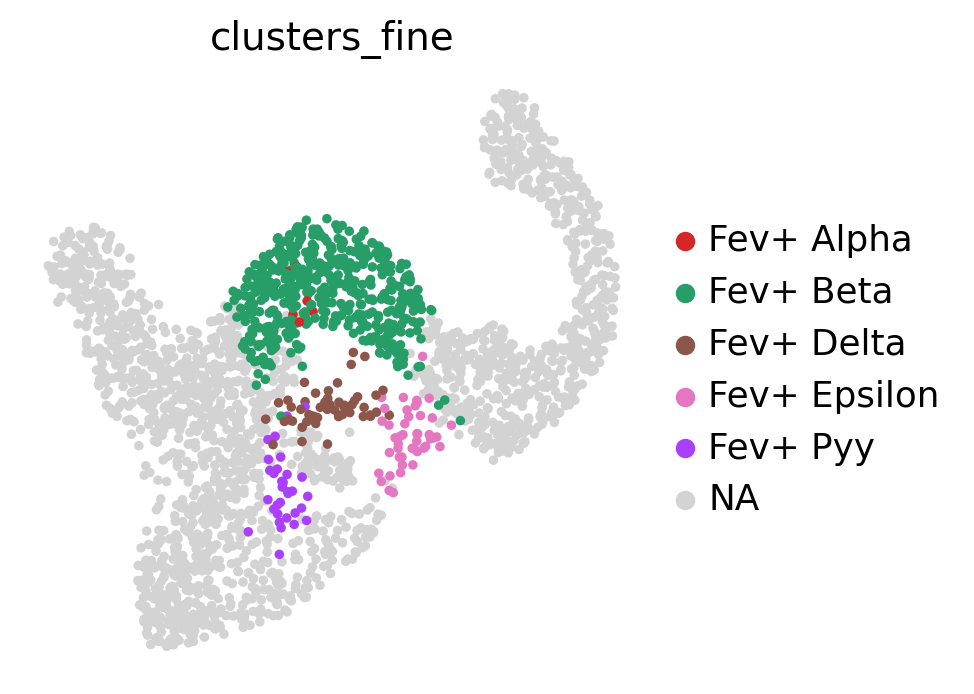
Often, we are interested in aggregated fate probabilities over a group of cells, like a cell- type or state. As an example, let’s focus on the Fev+ progenitor populations, and their fate commitment towards Delta cells. Let’s start with an overview of these subpopulations.
fev_states = ["Fev+ Beta", "Fev+ Alpha", "Fev+ Pyy", "Fev+ Delta", "Fev+ Epsilon"]
sc.pl.embedding(
    adata,
    basis="umap",
    color="clusters_fine",
    groups=fev_states,
    legend_loc="right margin",
)
Using violin plots, we visualize how fate-commited each of these populations is towards Delta cells.
cr.pl.aggregate_fate_probabilities(
    adata,
    mode="violin",
    lineages=["Delta"],
    cluster_key="clusters_fine",
    clusters=fev_states,
)
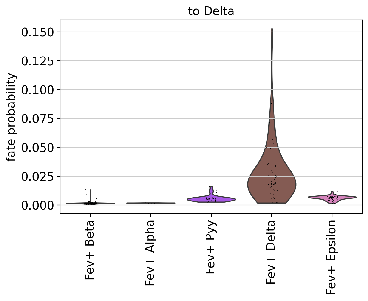
As expected, Fev+ Delta cells are most commited towards Delta cells. CellRank supports many more ways to visualize aggregated fate probabilities, for example via heatmaps, bar plots, or paga-pie charts, see the API.
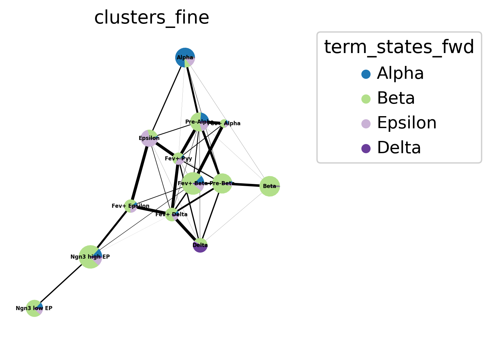
Let’s look at another plotting possibility - pie charts arranged in a PAGA plot. We first need to compute PAGA using scanpy [Wolf et al., 2019].
sc.tl.paga(adata, groups="clusters_fine")

cr.pl.aggregate_fate_probabilities(
    adata,
    mode="paga_pie",
    cluster_key="clusters_fine",
    legend_kwargs={"loc": "upper right out"},
    fontsize=4,
    edge_width_scale=0.3,
    dpi=150,
)
Uncover driver genes
Correlate fate probabilities with gene expression
We uncover putative driver genes by correlating fate probabilities with gene expression using the compute_lineage_drivers() method. In other words, if a gene is systematically higher or lower expressed in cells that are more or less likely to differentiate towards a given terminal states, respectively, then we call this gene a putative driver gene.
As an example, let’s focus on Delta cell generation again, and let’s restrict the correlation-computation to the relevant clusters.
driver_clusters = ["Delta", "Fev+", "Ngn3 high EP", "Ngn3 low EP"]

delta_df = g.compute_lineage_drivers(
    lineages=["Delta"], cluster_key="clusters", clusters=driver_clusters
)
delta_df.head(10)
INFO     Adding `adata.varm['terminal_lineage_drivers']`
                `.lineage_drivers`
             Finish (0.05s)
| Delta_corr | Delta_pval | Delta_qval | Delta_ci_low | Delta_ci_high | |
|---|---|---|---|---|---|
| index | |||||
| Sst | 0.837618 | 0.000000e+00 | 0.000000e+00 | 0.820782 | 0.852999 |
| Iapp | 0.734253 | 1.101395e-254 | 3.285461e-251 | 0.708401 | 0.758137 |
| Arg1 | 0.585548 | 2.595248e-131 | 5.161082e-128 | 0.548993 | 0.619867 |
| Frzb | 0.548492 | 4.214793e-111 | 6.286364e-108 | 0.509679 | 0.585077 |
| Pyy | 0.530892 | 1.761956e-102 | 2.102366e-99 | 0.491063 | 0.568505 |
| Rbp4 | 0.509664 | 7.963936e-93 | 7.918807e-90 | 0.468659 | 0.548478 |
| Hhex | 0.498949 | 3.079578e-88 | 2.624680e-85 | 0.457370 | 0.538352 |
| 1500009L16Rik | 0.490320 | 1.125453e-84 | 8.393066e-82 | 0.448288 | 0.530189 |
| Fam159b | 0.482760 | 1.202135e-81 | 7.968816e-79 | 0.440338 | 0.523030 |
| Ptprz1 | 0.459699 | 6.441979e-73 | 3.843284e-70 | 0.416131 | 0.501161 |
This computed correlation values, as well as p-values, multiple-testing corrected q-values, and confidence intervals.
Visualize putative driver genes
We can visually explore a few of these genes identified above.
adata.obs["fate_probabilities_delta"] = g.fate_probabilities["Delta"].X.flatten()

sc.pl.embedding(
    adata,
    basis="umap",
    color=["fate_probabilities_delta"] + list(delta_df.index[:8]),
    color_map="viridis",
    s=50,
    ncols=3,
    vmax="p96",
)
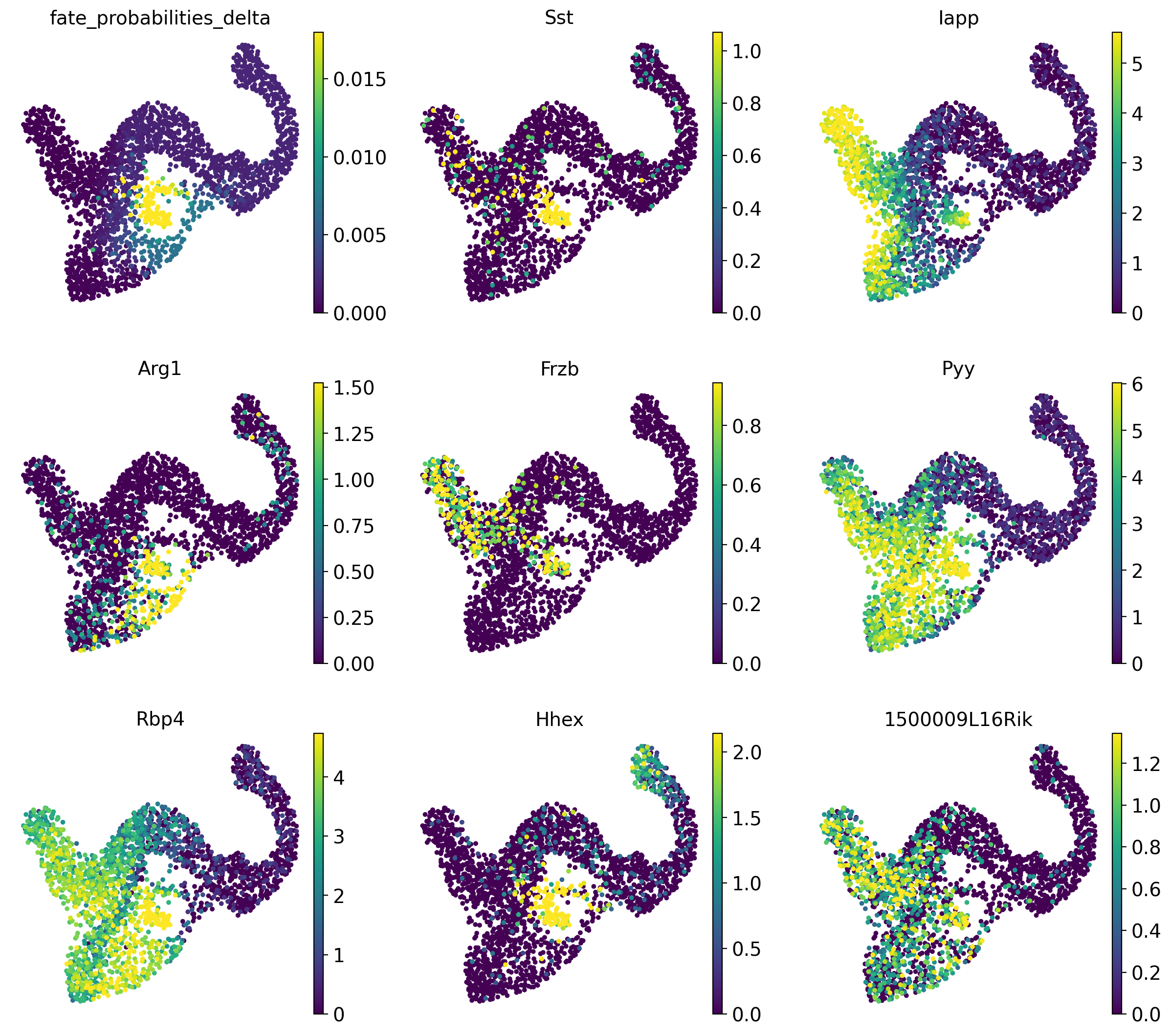
We show fate probabilities towards the Delta population and some of the top-correlating genes. Among them are Somatostatin (Sst; the hormone produced by Delta cells) and the homeodomain transcription factor Hhex (hematopoietically expressed homeobox), a known driver gene for Delta cell generation [Zhang et al., 2014].
Beyond Delta cells, let’s compute driver genes for all trajectories, and let’s visualize some of the top-correlating genes for the Alpha and Beta lineages using plot_lineage_drivers_correlation().
# compute driver genes
driver_df = g.compute_lineage_drivers()

# define set of genes to annotate
alpha_genes = ["Arx", "Gcg", "Irx2", "Etv1", "Pou6f2", "Meis2"]
beta_genes = ["Ins2", "Gng12", "Ins1", "Nkx6-1", "Pdx1", "Sytl4"]

genes_oi = {
    "Alpha": alpha_genes,
    "Beta": beta_genes,
}

# make sure all of these exist in AnnData
assert [gene in adata.var_names for genes in genes_oi.values() for gene in genes], (
    "Did not find all genes"
)

# compute mean gene expression across all cells
adata.var["mean expression"] = np.asarray(adata.X.mean(axis=0)).flatten()

# visualize in a scatter plot
g.plot_lineage_drivers_correlation(
    lineage_x="Beta",
    lineage_y="Alpha",
    adjust_text=True,
    gene_sets=genes_oi,
    color="mean expression",
    legend_loc="none",
    figsize=(5, 5),
    dpi=150,
    fontsize=9,
    size=50,
)
INFO     Adding `adata.varm['terminal_lineage_drivers']`
                `.lineage_drivers`
             Finish (0.12s)
INFO     Adjusting text position
INFO         Finish (1.08s)
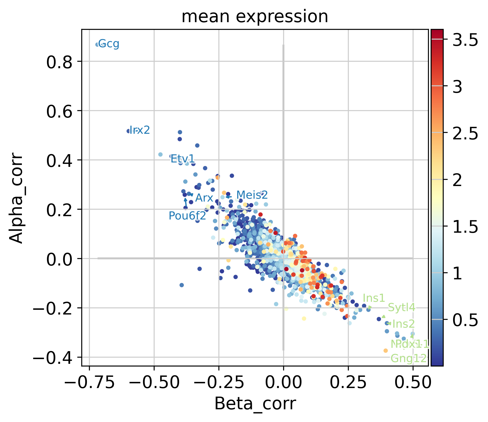
In the plot above, each dot represents a gene, colored by mean expression across all cells, with Beta- and Alpha correlations on the x- and y-axis, respectively. As expected, these two are anti-correlated; genes that correlate positively with the Alpha fate correlate negatively with the Beta fate and vice versa. We annotate a few transciption factors (TFs; according to https://www.ncbi.nlm.nih.gov/) with known functions in Beta-or Alpha trajectories, all of which are among the top-30 highest correlated genes:
Gene Name |
Reference |
Trajectory |
|---|---|---|
Arx |
PMID: 32149367, PMID: 23785486, PMID: 24236044 |
Alpha |
Irx2 |
PMID: 26977395 |
Alpha |
Etv1 |
PMID: 32439909 |
Alpha |
Gng12 |
PMID: 30254276 |
Beta |
Nkx6-1 |
PMID: 33121533, PMID: 34349281 |
Beta |
Pdx1 |
PMID: 31401713, PMID: 33526589, PMID: 28580283 |
Beta |
Sytl4 |
PMID: 27032672, PMID: 12058058 |
Beta |
Further, we annotate Gcg, the gene encoding the Alpha cell hormone Glucagon, as well as Ins1 and Ins2, the genes encoding the Beta cell hormone Insulin. We also annotate Pou6f2 and Meis2, two TFs which are highly correlated with the Alpha fate probabilities, with no known function in Alpha cell formation or maintenance, to the best of our knowledge. These serve as examples of how fate probabilities can be used to predict putative new driver genes.
Closing matters
What’s next?
In this tutorial, you learned how to compute, aggregate and visualize fate probabilities and predict driver genes. For the next steps, we recommend to:
go through the gene trend plotting tutorial to learn how to visulize gene dynamics in pseudotime.
take a look at the
APIto learn about parameters you can use to adapt these computations to your data.try this out on your own data.
Package versions
session_info2.session_info()