Visualizing and Clustering Gene Expression Trends
Preliminaries
In this tutorial, you will learn how to:
compute and visualize gene expression trends along specific differentiation trajectories.
cluster expression trends to detect genes with similar dynamical patterns.
This tutorial notebook can be downloaded using the following link.
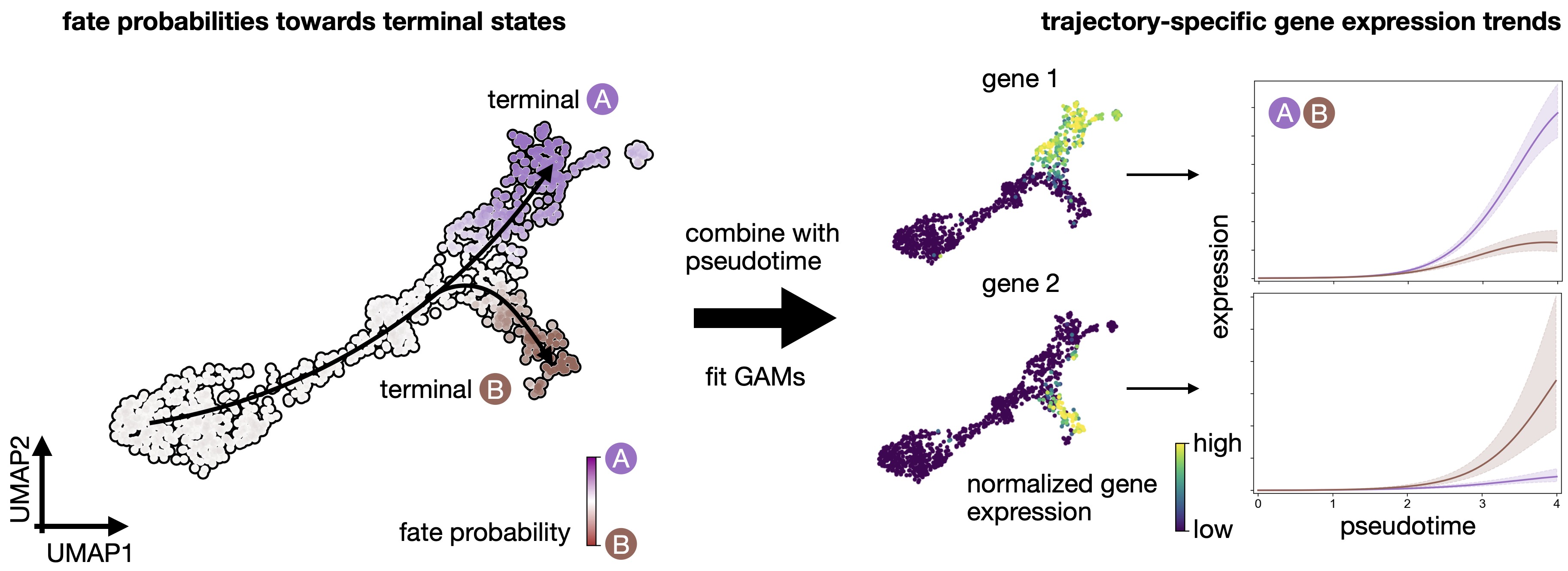
CellRank fits Generalized Additive Models to recover continuous gene expression dynamics along specific trajectories.
Note
If you want to run this on your own data, you will need:
a scRNA-seq dataset for which you computed a cell-cell transition matrix using any CellRank
kernel. For each kernel, there exist individual tutorials that teach you how to use them. For example, we have tutorials about using RNA velocity, experimental time points, and pseudotime, among others, to derive cell-cell transition probabilities.any pseudotime computed on your data. We’ll use the Palantir pseudotime in our example [Setty et al., 2019].
imputed gene expression data. We’ll use MAGIC here, but you can use any imputation strategy that works for your data [van Dijk et al., 2018].
Note
If you encounter any bugs in the code, our if you have suggestions for new features, please open an issue. If you have a general question or something you would like to discuss with us, please post on the scverse discourse.
Import packages & data
%load_ext autoreload
%autoreload 2
import sys

if "google.colab" in sys.modules:
    !pip install -q git+https://github.com/scverse/cellrank
import cellrank as cr
import matplotlib.pyplot as plt
import numpy as np
import pandas as pd
import scanpy as sc
import session_info2

cr.settings.logging_level = "INFO"
sc.set_figure_params(frameon=False, dpi=100)
import warnings

warnings.simplefilter("ignore", category=UserWarning)
To demonstrate the appproach in this tutorial, we will use a scRNA-seq dataset of pancreas development at embyonic day E15.5 [Bastidas-Ponce et al., 2019]. We used this dataset in our CellRank meets RNA velocity tutorial to compute a cell-cell transition matrix using the VelocityKernel; this tutorial builds on the transition matrix computed there. The dataset including the transition matrix can be conveniently acessed through cellrank.datasets.pancreas [Bastidas-Ponce et al., 2019, Bergen et al., 2020].
adata = cr.datasets.pancreas(kind="preprocessed-kernel")
Reconstruct a VelocityKernel from the AnnData object.
vk = cr.kernels.VelocityKernel.from_adata(adata, key="T_fwd")
vk
VelocityKernel[n=2531, model='deterministic', similarity='correlation', softmax_scale=4.013]
Note
The method from_adata() allows you to reconstruct a CellRank kernel from an AnnData object. When you use a kernel to compute a transition matrix, this matrix, as well as a few informations about the computation, are written to the underlying anndata.AnnData object upon calling write_to_adata(). This makes it easy to write and read kernels from disk via the associated AnnData object.
Compute terminal states and fate probabilities
We need to infer or assign terminal states and compute fate probabilities before we can visualize gene expression trends.
See also
To learn more about initial and terminal state identification, see Computing Initial and Terminal States. To learn more about the computation of fate_probabilities, see Estimating Fate Probabilities and Driver Genes.
g = cr.estimators.GPCCA(vk)
print(g)
GPCCA[kernel=VelocityKernel[n=2531], initial_states=None, terminal_states=None]
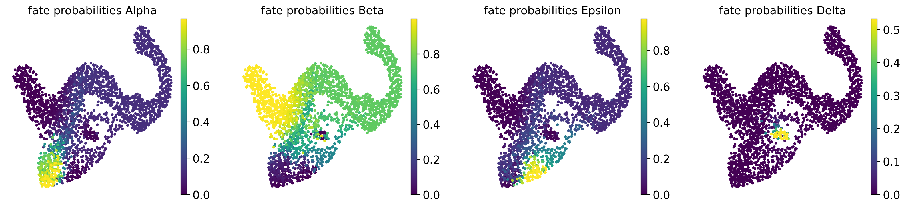
Fit the estimator to obtain macrostates, declare terminal_states, and compute fate_probabilities.
# compute macrostates
g.compute_macrostates(n_states=11, cluster_key="clusters")

# declare terminal states
g.set_terminal_states(states=["Alpha", "Beta", "Epsilon", "Delta"])

# compute and visualize fate probabilities
g.compute_fate_probabilities()
g.plot_fate_probabilities(same_plot=False)
INFO     Computing Schur decomposition
INFO     When computing macrostates, choose a number of states NOT in ``
INFO     Adding `adata.uns['eigendecomposition_fwd']`
                `.schur_vectors`
                `.schur_matrix`
                `.eigendecomposition`
             Finish (0.13s)
INFO     Computing 11 macrostates
INFO     Adding `.macrostates`
                `.macrostates_memberships`
                `.coarse_T`
                `.coarse_initial_distribution
                `.coarse_stationary_distribution`
                `.schur_vectors`
                `.schur_matrix`
                `.eigendecomposition`
             Finish (3.37s)
INFO     Adding `adata.obs['term_states_fwd']`
                `adata.obs['term_states_fwd_probs']`
                `.terminal_states`
                `.terminal_states_probabilities`
                `.terminal_states_memberships
             Finish`
INFO     Computing fate probabilities
INFO     Adding `adata.obsm['lineages_fwd']`
                `.fate_probabilities`
             Finish (0.14s)
[0]PETSC ERROR: ------------------------------------------------------------------------
[0]PETSC ERROR: Caught signal number 13 Broken Pipe: Likely while reading or writing to a socket
[0]PETSC ERROR: Try option -start_in_debugger or -on_error_attach_debugger
[0]PETSC ERROR: or see https://petsc.org/release/faq/#valgrind and https://petsc.org/release/faq/
[0]PETSC ERROR: configure using --with-debugging=yes, recompile, link, and run
[0]PETSC ERROR: to get more information on the crash.
Visualize gene expression trends
Prepare for trend plotting
To visualize gene expression trends, we fit Generalized Additive Models (GAMs) to MAGIC-imputed gene expression data, ordering cells in pseudotime, and weighting each cell’s contribution to each trajectory according to fate probabilities. While we will be using the Palantir pseudotime here, you can use whatever pseudotime works best for your data, including Diffusion Pseudotime (DPT). Let’s start by visulizing the Palantir pseudotime.
sc.pl.embedding(
    adata,
    basis="umap",
    color=["clusters", "palantir_pseudotime"],
    color_map="gnuplot",
    legend_loc="on data",
)
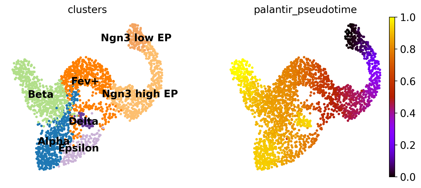
This looks promising, the pseudotime increases continiously from early states (Ngn3 low EP) until late states (Alpha, Beta, Delta, Epsilon). We can make this more quantitative, without relying on the 2D UMAP, by showing the distribution of pseudotime values per cluster.
sc.pl.violin(adata, keys=["palantir_pseudotime"], groupby="clusters", rotation=90)
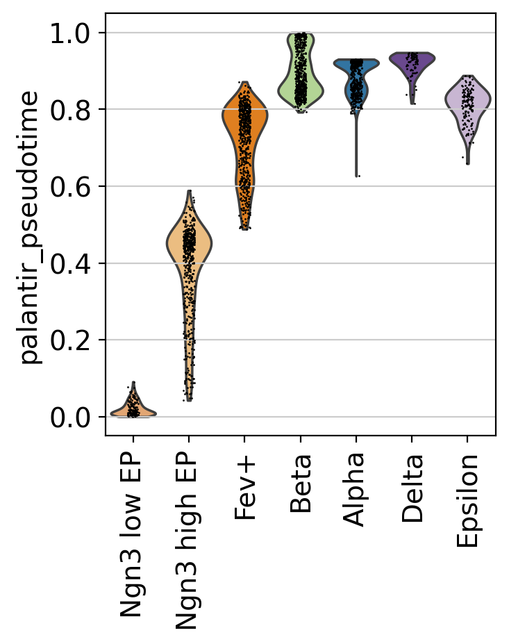
This confirms what we saw in the UMAP.
Visualize expression trends via line plots
The first step in gene trend plotting is to initialite a model for GAM fitting.
model = cr.models.GAM(adata)
Next, we specify the pseudotime via the time_key, the data layer via the data_key, the gene set via genes, and a few other parameters for plotting. See the API for a full description.
with warnings.catch_warnings():
    warnings.simplefilter("ignore")

    cr.pl.gene_trends(
        adata,
        model=model,
        genes=["Arx", "Pdx1", "Hhex", "Enpp1"],
        same_plot=True,
        ncols=2,
        time_key="palantir_pseudotime",
        hide_cells=True,
        data_key="X",
    )
INFO Computing trends using 1 core(s)
INFO         Finish (0.55s)
INFO     Plotting trends
[0]PETSC ERROR: ------------------------------------------------------------------------
[0]PETSC ERROR: Caught signal number 13 Broken Pipe: Likely while reading or writing to a socket
[0]PETSC ERROR: Try option -start_in_debugger or -on_error_attach_debugger
[0]PETSC ERROR: or see https://petsc.org/release/faq/#valgrind and https://petsc.org/release/faq/
[0]PETSC ERROR: configure using --with-debugging=yes, recompile, link, and run
[0]PETSC ERROR: to get more information on the crash.
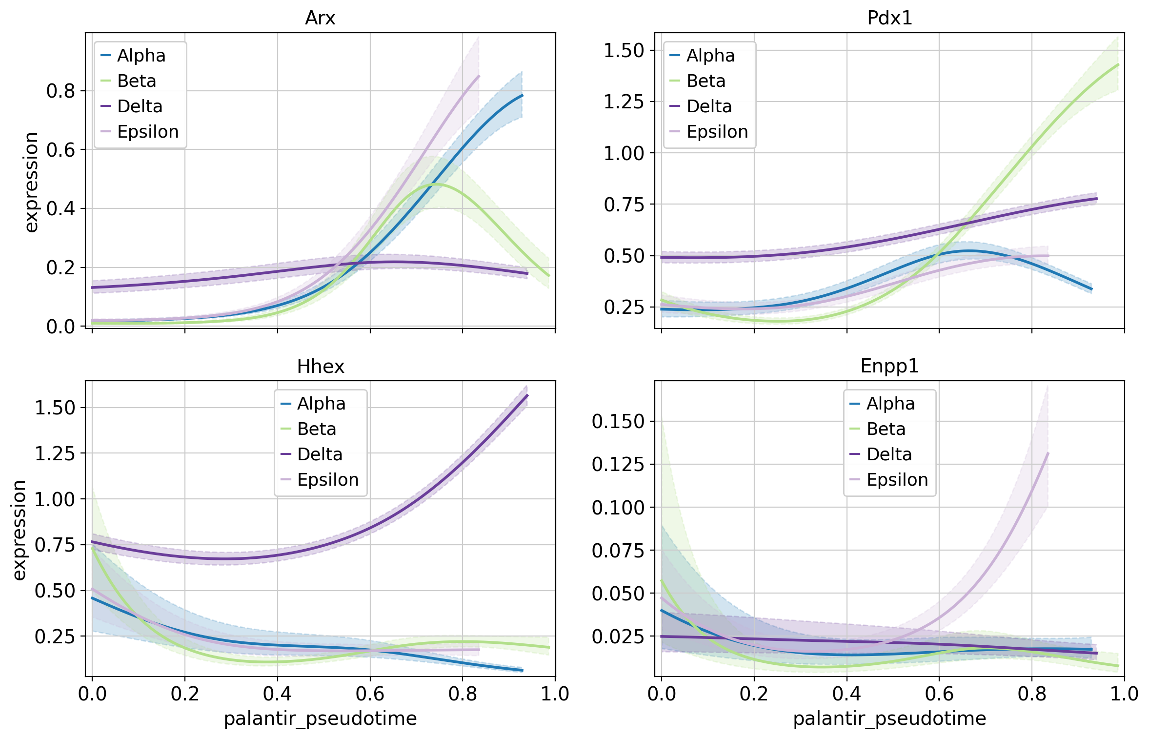
Above, we highlight the trajectory-specific dynamics of a few TFs, some of which have known functions in pancreatic fate specification. For example, Hhex and Arx are involved in Delta and Alpha cell generation, respectively [Wilcox et al., 2013, Zhang et al., 2014].
Visualize expression cascades via heatmaps
In this section, we focus on just one trajectory and visualize the temporal activation of several genes along this trajectory. As an example, let’s take the Beta trajectory. We computed putative driver genes for this trajectory in the Estimating Fate Probabilities and Driver Genes tutorial, here, we explore their temporal activation cascade. To do this, as before, we fit the expression of putative Beta-driver genes along the pseudotime using GAMs, weighting each cell’s contribution according to Beta fate_probabilities.
# compute putative drivers for the Beta trajectory
beta_drivers = g.compute_lineage_drivers(lineages="Beta")

# plot heatmap
with warnings.catch_warnings():
    warnings.simplefilter("ignore")

    cr.pl.heatmap(
        adata,
        model=model,  # use the model from before
        lineages="Beta",
        cluster_key="clusters",
        show_fate_probabilities=True,
        data_key="X",
        genes=beta_drivers.head(40).index,
        time_key="palantir_pseudotime",
        figsize=(12, 10),
        show_all_genes=True,
    )
INFO     Adding `adata.varm['terminal_lineage_drivers']`
                `.lineage_drivers`
             Finish (0.08s)
INFO     Computing trends using 1 core(s)
INFO Finish (1.07s)
[0]PETSC ERROR: ------------------------------------------------------------------------
[0]PETSC ERROR: Caught signal number 13 Broken Pipe: Likely while reading or writing to a socket
[0]PETSC ERROR: Try option -start_in_debugger or -on_error_attach_debugger
[0]PETSC ERROR: or see https://petsc.org/release/faq/#valgrind and https://petsc.org/release/faq/
[0]PETSC ERROR: configure using --with-debugging=yes, recompile, link, and run
[0]PETSC ERROR: to get more information on the crash.
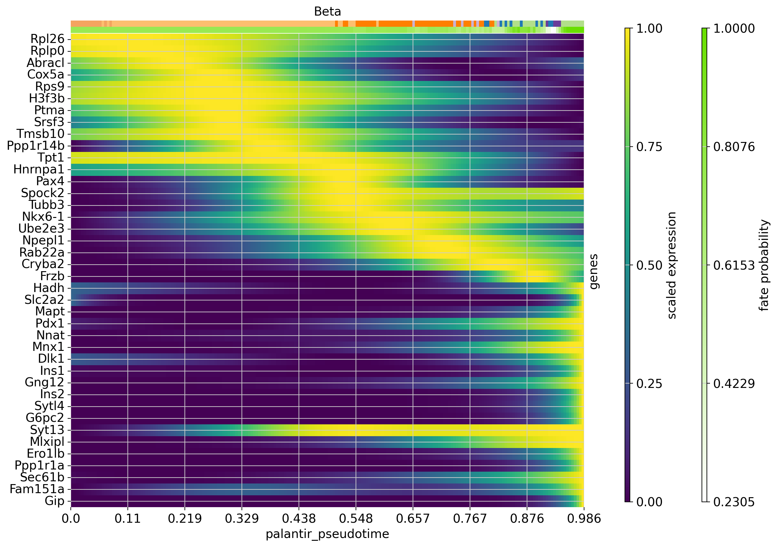
Each row in this heatmap corresponds to one gene, sorted according to their expression peak in pseudotime. We show cluster annotations, and the fate probabilities used to determine each cells’s contribution to the Beta trajectory, at the top.
Our analysis suggests the following temporal activation of TFs with known function in Beta-cell fate choice: TPT1 (also called TCTP) [Diraison et al., 2011, Tsai et al., 2014] peaks early, followed by Pax4 [Napolitano et al., 2015, Sosa-Pineda et al., 1997] and Mnx1 [Dalgin and Prince, 2012, Pan et al., 2015]. As expected, Ins1 and Ins2 peak late, and so do Gng12 [Byrnes et al., 2018] and Pdx1 [Bastidas-Ponce et al., 2017, Moin and Butler, 2019, Zhu et al., 2021].
Beyond genes with a previously documented role in Beta cell fate choice, this analysis also pinpoints putative new drivers, including the early-peaking TFs Ptma and Srsf3.
Cluster gene expression trends
Compute clustering
To identify genes with similar expression patterns, CellRank can cluster expression trends. Importantly, we do this again in a trajectory-specific fashion, i.e. we only consider GAM-fitted expression trends towards Beta cells and cluster these. We only consider highly-variable genes here to speed up the computation.
model = cr.models.GAM(adata, max_iter=100)  # instead of default 2000

with warnings.catch_warnings():
    warnings.simplefilter("ignore", RuntimeWarning)

    cr.pl.cluster_trends(
        adata,
        model=model,
        lineage="Beta",
        data_key="X",
        genes=adata[:, adata.var["highly_variable"]].var_names,
        time_key="palantir_pseudotime",
        n_jobs=12,
        backend="threading",
        random_state=0,
        recompute=True,
        clustering_kwargs={"resolution": 0.2, "random_state": 0},
        neighbors_kwargs={"random_state": 0},
    )
INFO Computing trends using 12 core(s)
[0]PETSC ERROR: ------------------------------------------------------------------------
[0]PETSC ERROR: Caught signal number 13 Broken Pipe: Likely while reading or writing to a socket
[0]PETSC ERROR: Try option -start_in_debugger or -on_error_attach_debugger
[0]PETSC ERROR: or see https://petsc.org/release/faq/#valgrind and https://petsc.org/release/faq/
[0]PETSC ERROR: configure using --with-debugging=yes, recompile, link, and run
[0]PETSC ERROR: to get more information on the crash.
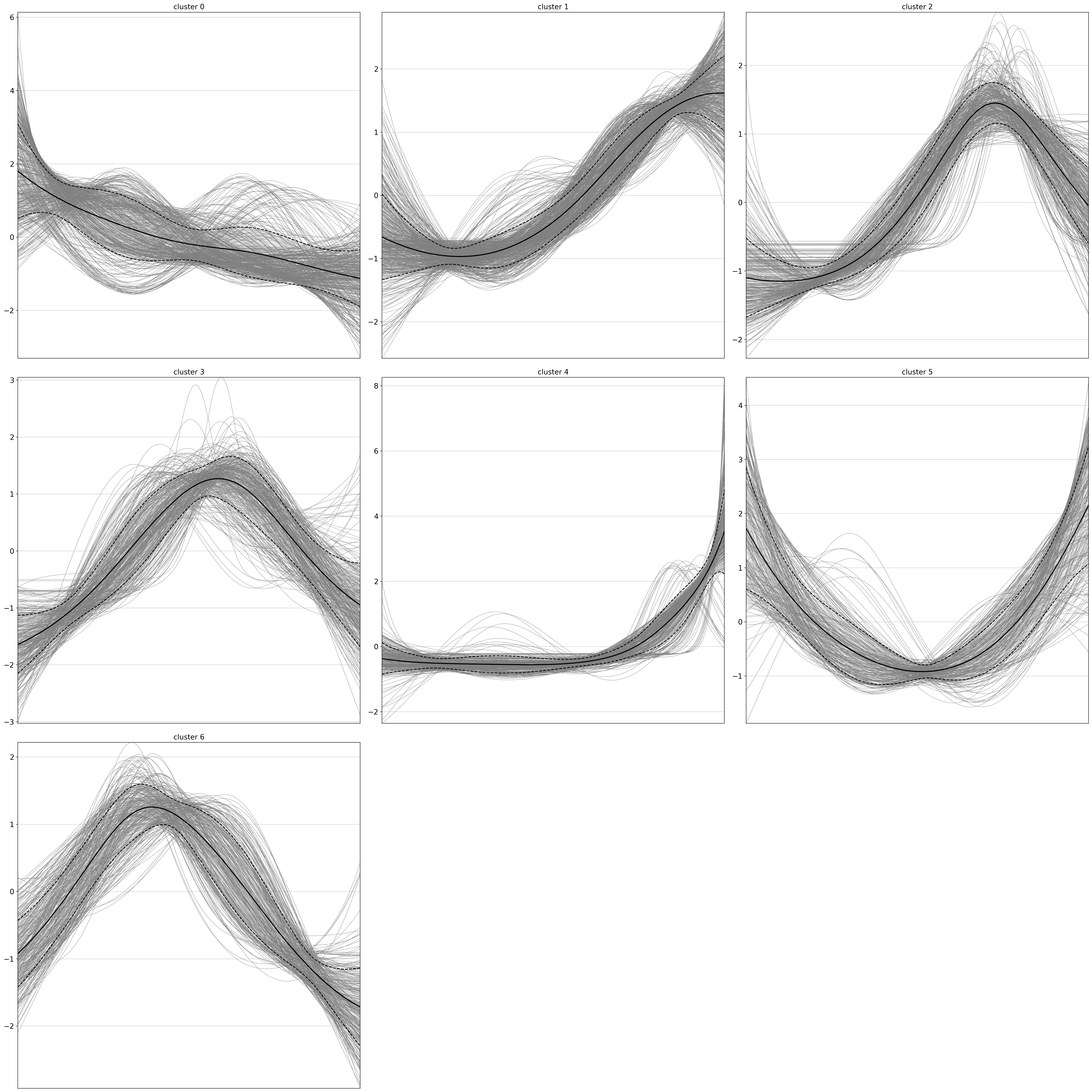
The results are written to uns, conveniently as an AnnData object, where genes now take the role of the observations.
gdata = adata.uns["lineage_Beta_trend"].copy()
gdata
AnnData object with n_obs × n_vars = 2000 × 200
    obs: 'clusters'
    var: 'x_test'
    uns: 'pca', 'neighbors', 'clusters'
    obsm: 'X_pca'
    varm: 'PCs'
    obsp: 'distances', 'connectivities'
Let’s merge some gene annotations from the original AnnData object.
cols = ["means", "dispersions"]
gdata.obs = gdata.obs.merge(
    right=adata.var[cols], how="left", left_index=True, right_index=True
)
gdata
AnnData object with n_obs × n_vars = 2000 × 200
    obs: 'clusters', 'means', 'dispersions'
    var: 'x_test'
    uns: 'pca', 'neighbors', 'clusters'
    obsm: 'X_pca'
    varm: 'PCs'
    obsp: 'distances', 'connectivities'
Analzye gene clusters
We have a gene-level PCA and k-NN graph - let’s use that to compute and plot a gene-level UMAP embedding.
sc.tl.umap(gdata, random_state=0)

sc.pl.embedding(gdata, basis="umap", color=["clusters", "means"], vmax="p95")
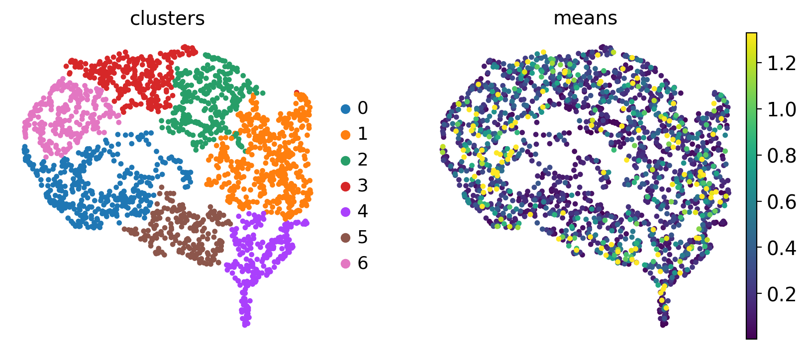
Each dot represent a gene, colored by expression trend clusters along the Beta trajectory (left) or the mean expression across cells (right). Let’s highlight a few driver genes we discussed above.
genes = ["Gng12", "Ins1", "Ins2", "Pdx1", "Mnx1", "Ptma", "Srsf3", "Pax4"]

mask = np.array([gene in gdata.obs_names for gene in genes])
if not mask.all():
    print(f"Could not find {np.array(genes)[~mask]}")
genes = list(np.array(genes)[mask])

gdata.obs["highlight"] = pd.Categorical(
    [g if g in genes else np.nan for g in gdata.obs_names]
)

fig, axes = plt.subplots(1, 2, figsize=(14, 5))

# left panel: clusters
sc.pl.embedding(
    gdata,
    basis="umap",
    color="clusters",
    legend_loc="right margin",
    ax=axes[0],
    show=False,
    title="clusters",
)

# right panel: all genes colored by cluster at low alpha (no legend)
sc.pl.embedding(
    gdata,
    basis="umap",
    color="clusters",
    alpha=0.3,
    size=30,
    legend_loc="none",
    ax=axes[1],
    show=False,
    title="driver genes",
)

# overlay: selected genes colored by name, with black outline
coords = gdata.obsm["X_umap"]
hit_mask = gdata.obs_names.isin(genes)
hit_labels = gdata.obs["highlight"][hit_mask]
palette = dict(zip(hit_labels.cat.categories, sc.pl.palettes.default_20))

for gene in genes:
    ix = gdata.obs_names.get_loc(gene)
    axes[1].scatter(
        coords[ix, 0],
        coords[ix, 1],
        c=palette[gene],
        s=120,
        zorder=10,
        edgecolors="black",
        linewidths=1.5,
        label=gene,
    )

axes[1].legend(
    loc="center left", bbox_to_anchor=(1, 0.5), frameon=False, title="driver genes"
)
plt.tight_layout()
plt.show()

del gdata.obs["highlight"]
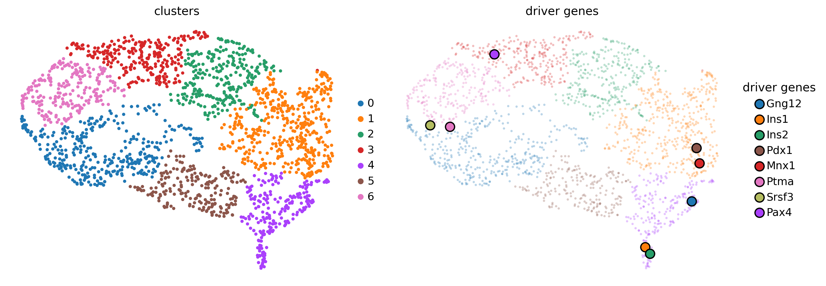
Many of the late-peaking TFs we discussed when plotting the heatmap, including Gng12, Ins1, Ins2, Pdx1 and Mnx1, are assigned to clusters 1 or 4, which are indeed a late-peaking clusters. We can confirm this by checking in the gdata object.
gdata[genes].obs
| clusters | means | dispersions | |
|---|---|---|---|
| Gng12 | 4 | 0.878893 | 1.414954 |
| Ins1 | 4 | 2.744454 | 5.726741 |
| Ins2 | 4 | 2.016665 | 4.514492 |
| Pdx1 | 1 | 0.990023 | 1.193838 |
| Mnx1 | 1 | 0.295992 | 0.935342 |
| Ptma | 0 | 2.462189 | 1.153156 |
| Srsf3 | 6 | 1.438808 | 0.470357 |
| Pax4 | 3 | 0.794812 | 1.326806 |
Pax4 is assigned to the intermediate-peak cluster 3, we can now query for genes that have similar expression dynamics along the Beta trajectory by looking at genes from the same cluster.
# obtain some genes from the same cluster, sort by mean expression
mid_peak_genes = (
    gdata[gdata.obs["clusters"] == "3"]
    .obs.sort_values("means", ascending=False)
    .head(8)
    .index
)

# plot
with warnings.catch_warnings():
    warnings.simplefilter("ignore", RuntimeWarning)

    cr.pl.gene_trends(
        adata,
        model=model,
        lineages="Beta",
        cell_color="clusters",
        data_key="X",
        genes=["Pax4"] + list(mid_peak_genes),
        same_plot=True,
        ncols=3,
        time_key="palantir_pseudotime",
        hide_cells=False,
    )
[0]PETSC ERROR: ------------------------------------------------------------------------
[0]PETSC ERROR: Caught signal number 13 Broken Pipe: Likely while reading or writing to a socket
[0]PETSC ERROR: Try option -start_in_debugger or -on_error_attach_debugger
[0]PETSC ERROR: or see https://petsc.org/release/faq/#valgrind and https://petsc.org/release/faq/
[0]PETSC ERROR: configure using --with-debugging=yes, recompile, link, and run
[0]PETSC ERROR: to get more information on the crash.
--------------------------------------------------------------------------
MPI_ABORT was invoked on rank 0 in communicator MPI_COMM_WORLD
  Proc: [[46495,0],0]
  Errorcode: 59

NOTE: invoking MPI_ABORT causes Open MPI to kill all MPI processes.
You may or may not see output from other processes, depending on
exactly when Open MPI kills them.
--------------------------------------------------------------------------
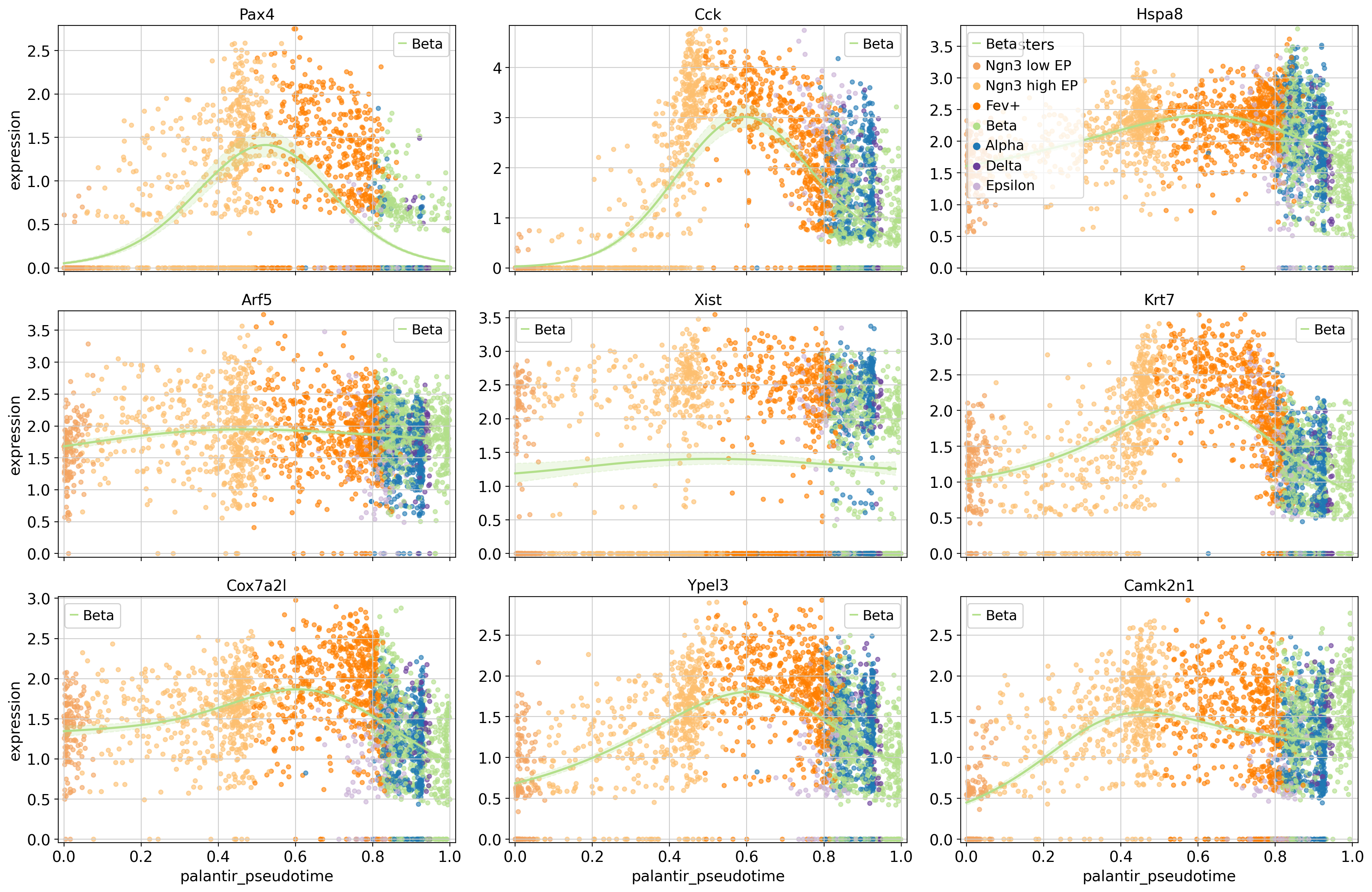
To showcase the flexibility of this plotting function, we’re only drawing the trends towards Beta, and we visualize cells, colored by their cluster assignment. This serves as an example of how gene trend clustering can be used to identify genes that show similar expression dynamics to a known driver gene of a given lineage.
Closing matters
What’s next?
In this tutorial, you learned how to visualize trajectory-specific gene expression trends via line plots or heatmaps, and how to cluster them. For the next steps, we recommend to:
explore this with cell-transitions derived from another
kernel. The advantage of CellRank is that you can run the exact same computations from above, no matter what data modality you used to obtain your cell-cell transition matrix.take a look at the
APIto learn about parameters you can use to adapt these computations to your data.try this out on your own data.
Package versions
session_info2.session_info()