CellRank Meets Pseudotime
Preliminaries
In this tutorial, you will learn how to:
compute a pseudotime using
Diffusion pseudotime (DPT)[Haghverdi et al., 2016].use CellRank’s
PseudotimeKernelto compute a transition matrix based on any pseudotime of your liking.visualize the transition matrix in a low-dimensional embedding.
Along the way, we’ll see an example where RNA velocity does not work well [Bergen et al., 2020, Bergen et al., 2021, La Manno et al., 2018]; this motivates us to use the PseudotimeKernel.
This tutorial notebook can be downloaded using the following link.
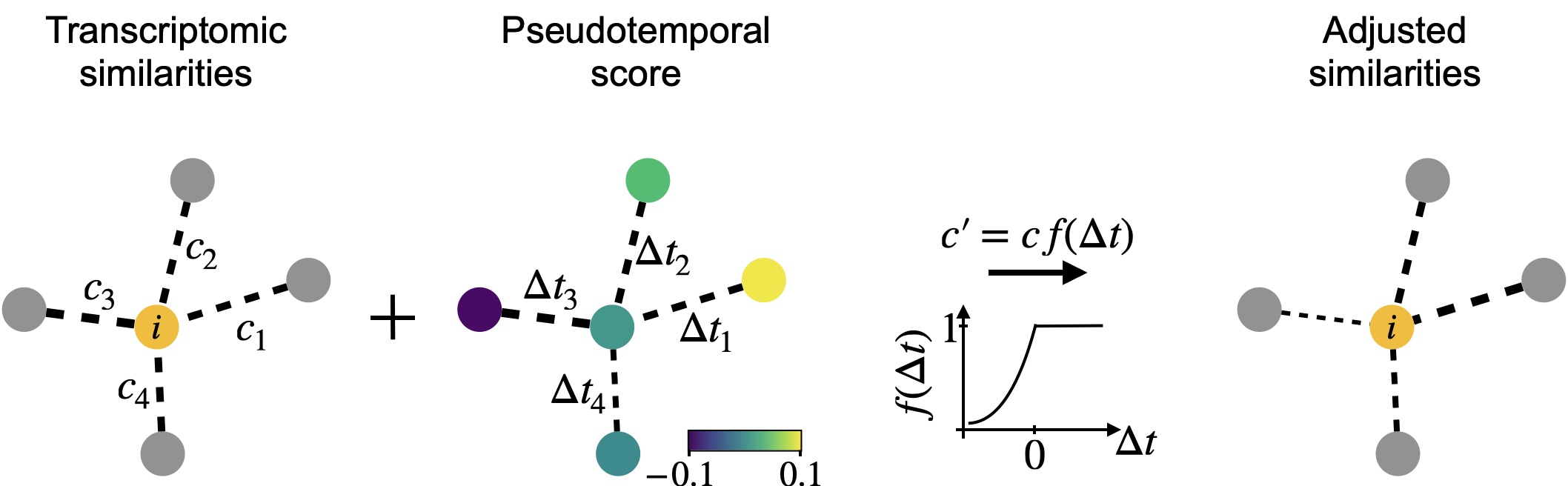
The PseudotimeKernel recovers differentiation directionality: We infuse directionality into a k-NN graph using any pseudotime; edges that point into the pseudotemporal “past” are donw-weighted. This can be understood as an adapted, soft version of the Palantir algorithm [Setty et al., 2019].
Note
If you want to run this on your own data, you will need:
a scRNA-seq dataset for which you have computed a pseudotime using a tool like
dpt()[Haghverdi et al., 2016], Palantir [Setty et al., 2019] or Slingshot [Street et al., 2018].
Note
If you encounter any bugs in the code, our if you have suggestions for new features, please open an issue. If you have a general question or something you would like to discuss with us, please post on the scverse discourse.
Import packages & data
%load_ext autoreload
%autoreload 2
import sys

if "google.colab" in sys.modules:
    !pip install -q git+https://github.com/scverse/cellrank
import cellrank as cr
import numpy as np
import scanpy as sc
import scvelo as scv
import session_info2

scv.settings.verbosity = 3
sc.set_figure_params(frameon=False, dpi=100)
cr.settings.logging_level = "INFO"
import warnings

warnings.simplefilter("ignore", category=UserWarning)
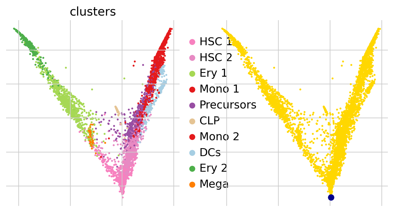
To demonstrate the appproach in this tutorial, we will use a scRNA-seq dataset of human bone marrow [Setty et al., 2019], which can be conveniently acessed through bone_marrow.
adata = cr.datasets.bone_marrow()
adata
AnnData object with n_obs × n_vars = 5780 × 27876
    obs: 'clusters', 'palantir_pseudotime', 'palantir_diff_potential'
    var: 'palantir'
    uns: 'clusters_colors', 'palantir_branch_probs_cell_types'
    obsm: 'MAGIC_imputed_data', 'X_tsne', 'palantir_branch_probs'
    layers: 'spliced', 'unspliced'
Check RNA velocity on this data
Before diving into the actual PseudotimeKernel, let’s motivate this choice a bit. We’ve seen that RNA velocity works well across a range of datasets including the pancres data from the CellRank Meets RNA Velocity tutorial [Bastidas-Ponce et al., 2019, Bergen et al., 2020]; so let’s check how RNA velocity performs on this dataset.
We’ll check the ratio of spliced to unspliced counts, go through some basic preprocessing, run scvelo, compute a transition matrix using the VelocityKernel and visualize it. To learn more about these steps, please see the CellRank Meets RNA Velocity tutorial.
scv.pl.proportions(adata)
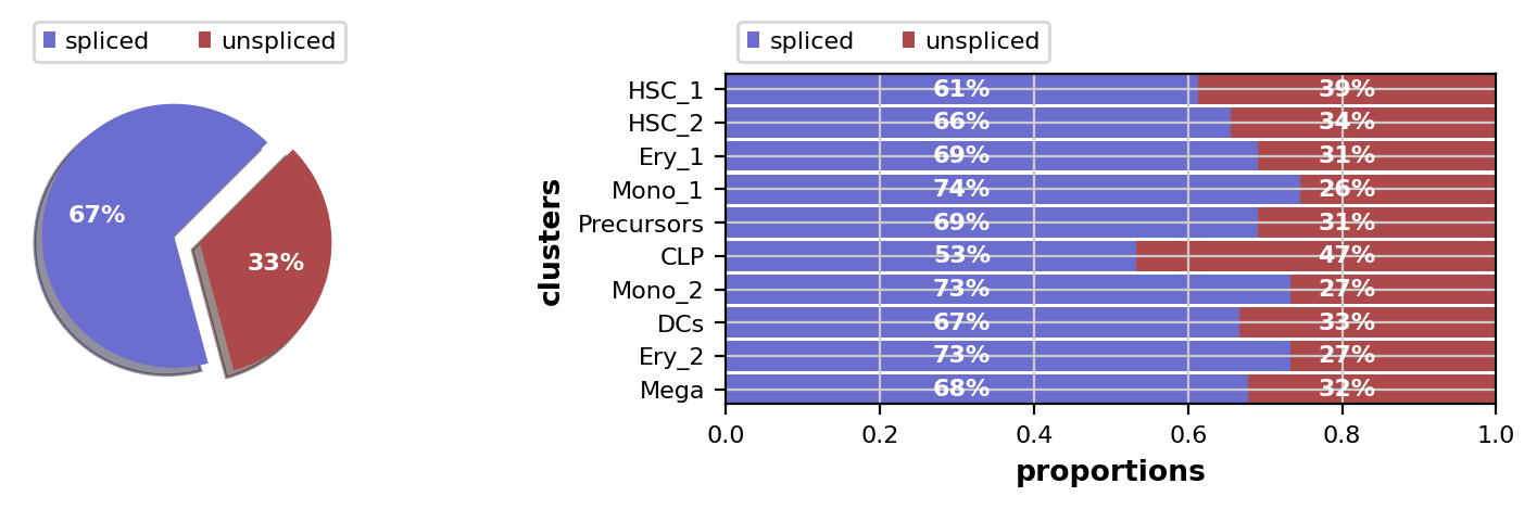
This looks fine, the percentage of unspliced reads is about what we would expect for 10x Chromium data [La Manno et al., 2018]. Next, filter out genes which don’t have enough spliced/unspliced counts, normalize and log transform the data and restrict to the top highly variable genes. Further, compute principal components and moments for velocity estimation.
# filter and normalize - scVelo uses pre-filtering gene counts per cell to determine
# the library size for normalization
scv.pp.filter_genes(adata, min_shared_counts=20)
scv.pp.normalize_per_cell(adata)

# log transformation and hvg
sc.pp.log1p(adata)
sc.pp.highly_variable_genes(adata, n_top_genes=2000)

# pca, neighbors, and moments.
sc.tl.pca(adata)
sc.pp.neighbors(adata, n_pcs=30, n_neighbors=30, random_state=0)
scv.pp.moments(adata, n_pcs=None, n_neighbors=None)
Filtered out 20068 genes that are detected 20 counts (shared).
Normalized count data: X, spliced, unspliced.
computing moments based on connectivities
    finished (0:00:02) --> added
    'Ms' and 'Mu', moments of un/spliced abundances (adata.layers)
Use the dynamical model from scVelo to estimate model parameters and compute velocities. On my MacBook using 8 cores, the below cell takes about 2 min to execute.
scv.tl.recover_dynamics(adata, n_jobs=-1)
scv.tl.velocity(adata, mode="dynamical")
recovering dynamics (using 128/128 cores)
/cluster/project/treutlein/USERS/mlange/github/cellrank/docs/notebooks/.pixi/envs/default/lib/python3.12/multiprocessing/popen_fork.py:66: DeprecationWarning: This process (pid=564261) is multi-threaded, use of fork() may lead to deadlocks in the child.
  self.pid = os.fork()
[0]PETSC ERROR: ------------------------------------------------------------------------
[0]PETSC ERROR: Caught signal number 13 Broken Pipe: Likely while reading or writing to a socket
[0]PETSC ERROR: Try option -start_in_debugger or -on_error_attach_debugger
[0]PETSC ERROR: or see https://petsc.org/release/faq/#valgrind and https://petsc.org/release/faq/
[0]PETSC ERROR: configure using --with-debugging=yes, recompile, link, and run
[0]PETSC ERROR: to get more information on the crash.
    finished (0:00:50) --> added
    'fit_pars', fitted parameters for splicing dynamics (adata.var)
computing velocities
    finished (0:00:01) --> added
    'velocity', velocity vectors for each individual cell (adata.layers)
Set up the VelocityKernel from the anndata.AnnData object containing the scVelo-computed velocities and compute a cell-cell transition matrix.
vk = cr.kernels.VelocityKernel(adata)
vk.compute_transition_matrix()
INFO Computing transition matrix using 'deterministic' model
/cluster/project/treutlein/USERS/mlange/github/cellrank/docs/notebooks/.pixi/envs/default/lib/python3.12/multiprocessing/popen_fork.py:66: DeprecationWarning: This process (pid=564261) is multi-threaded, use of fork() may lead to deadlocks in the child.
  self.pid = os.fork()
INFO Using `softmax_scale=1.5839`
[0]PETSC ERROR: ------------------------------------------------------------------------
[0]PETSC ERROR: Caught signal number 13 Broken Pipe: Likely while reading or writing to a socket
[0]PETSC ERROR: Try option -start_in_debugger or -on_error_attach_debugger
[0]PETSC ERROR: or see https://petsc.org/release/faq/#valgrind and https://petsc.org/release/faq/
[0]PETSC ERROR: configure using --with-debugging=yes, recompile, link, and run
[0]PETSC ERROR: to get more information on the crash.
/cluster/project/treutlein/USERS/mlange/github/cellrank/docs/notebooks/.pixi/envs/default/lib/python3.12/multiprocessing/popen_fork.py:66: DeprecationWarning: This process (pid=564261) is multi-threaded, use of fork() may lead to deadlocks in the child.
  self.pid = os.fork()
INFO Finish (8.32s)
VelocityKernel[n=5780, model='deterministic', similarity='correlation', softmax_scale=np.float64(1.584)]
Visualize via stream lines an a t-SNE embedding [Van der Maaten and Hinton, 2008]:
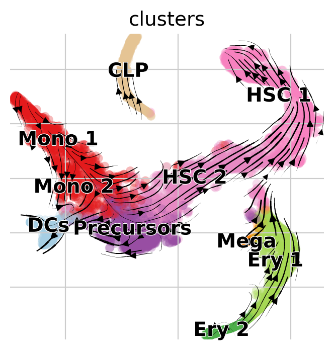
vk.plot_projection(basis="tsne")
INFO     Projecting transition matrix onto 'tsne'
INFO     Adding `adata.obsm['T_fwd_tsne']` (0.54s)
Note
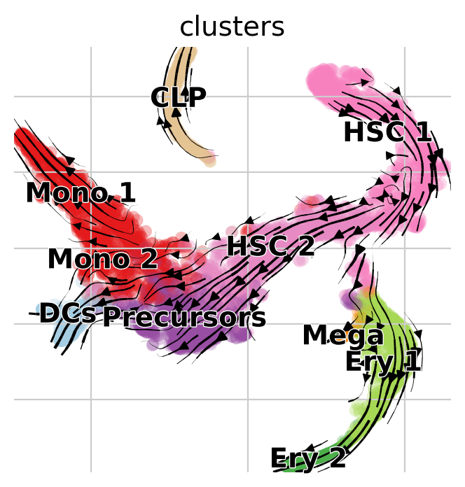
Arrows point opposite the known differentiation trajectory in which hematopoietic stems cells (HSCs) differentiate via intermediate states towards Monocyotes (Mono), Dendritic cells (DCs), etc [Setty et al., 2019]. That’s not just a result of the low-dimensional representation, feel free to use CellRank to compute initial and terminal states on this data (see Computing Initial and Terminal States tutorial) and you’ll find them to be inconsistend with biological knowledge as well.
To explore why this may be the case, let’s look into the most influential genes driving the velocity flow here:
top_genes = adata.var["fit_likelihood"].sort_values(ascending=False).index
scv.pl.scatter(adata, basis=top_genes[:10], ncols=5, frameon=False)
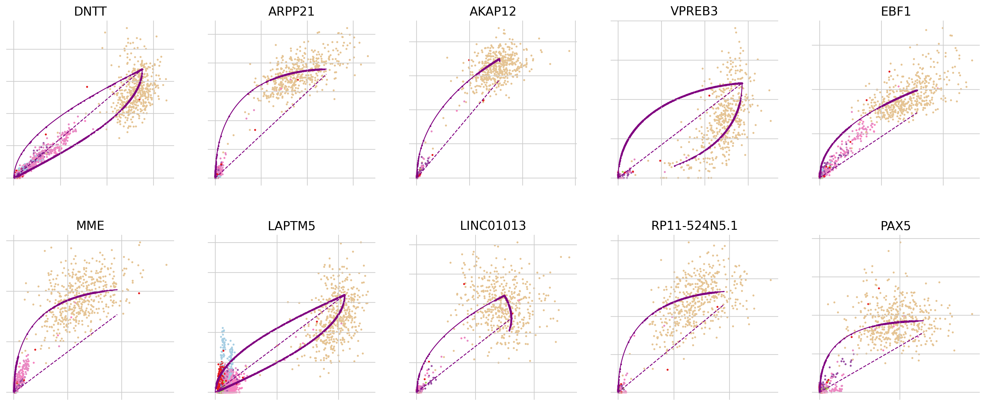
In all of the top likelihood genes, the common lymphoid progenitor cells (CLPs) represent an outlier population. Since the current scvelo model does not account for state-dependent kinetic parmeters, this means the CLPs bias the parameter values for all other cells. We explored what happens if we remove CLPs and re-run the above analysis steps:
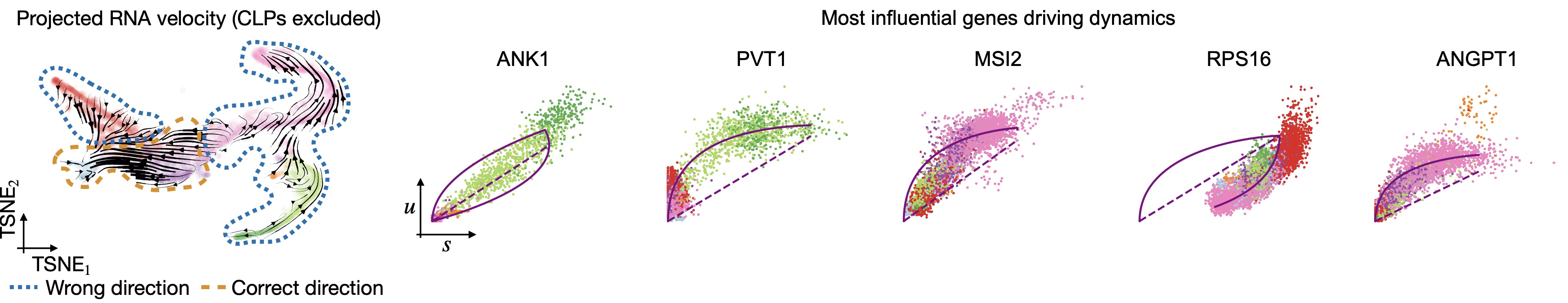
Removing CLPs does not resolve the problem: Even with CLPs removed, projected velocities still point oppposite to what’s known. The top-likelihood genes look different now - the CLP outliers have been removed; however, many of these top-influential genes show signs of state and time-dependent kinetic parameters. For example, in ANK1, Erythroid cells seem to require their own parameter set and in RPS16, the direction is inverted, i.e., an up-regulation is detected as a down-regulation, probably due to transcriptional bursting [Barile et al., 2021, Bergen et al., 2021].
There’s an easy way in CellRank to overcome these difficulties - use another kernel! In this tutorial, we’ll use the PseudotimeKernel because hematopoiesis is a well-studied system where traditional pseutodime methods work well.
Use pseudotime to recover directed differentiation
Choosing the right pseudotime
There are many pseudotime algorithms out there, so how do you choose the right one for your data [Saelens et al., 2019]? We’ll do a very superficial analysis here and just compare two methods: diffusion pseudotime (DPT) and the Palantir pseudotime [Haghverdi et al., 2016, Setty et al., 2019].
The Palantir pseudotime has been precomputed for this dataset, check the original tutorial and the scanpy interface to learn how to do this. To compute DPT on this dataset, we’ll start by computing a diffusion map [Coifman et al., 2005, Haghverdi et al., 2015].
sc.tl.diffmap(adata)
For DPT, we manually have to suply a root cell (recall, we’re not using any RNA velocity here). One (semi-manual) way of doing this is by using extrema of diffusion components:
root_ixs = 2394  # has been found using `adata.obsm['X_diffmap'][:, 3].argmax()`
scv.pl.scatter(
    adata,
    basis="diffmap",
    c=["clusters", root_ixs],
    legend_loc="right",
    components=["2, 3"],
)

adata.uns["iroot"] = root_ixs
Once we found a root cell we’re happy with (a cell from the HSC cluster), we can compute DPT and compare it with the precomputed Palantir pseudotime:
sc.tl.dpt(adata)
sc.pl.embedding(
    adata,
    basis="tsne",
    color=["dpt_pseudotime", "palantir_pseudotime"],
    color_map="gnuplot2",
)
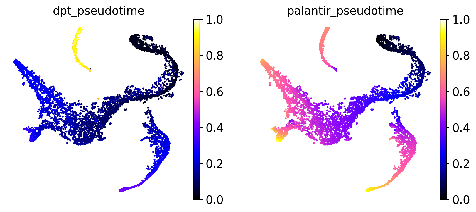
It seems like DPT is a bit biased towards the CLPs; it assigns very high values to that cluster which masks variation among the other states. We can further explore this with violin plots to visualize the distribution of pseudotime values per cluster, restricted to those clusters we expect to belong to a certain trajectory, e.g. the Monocyte or Erythroid trajectories:
mono_trajectory = ["HSC_1", "HSC_2", "Precursors", "Mono_1", "Mono_2"]
ery_trajectory = ["HSC_1", "Ery_1", "Ery_2"]

# plot the Monocyte trajectory
mask = np.isin(adata.obs["clusters"], mono_trajectory)
sc.pl.violin(
    adata[mask],
    keys=["dpt_pseudotime", "palantir_pseudotime"],
    groupby="clusters",
    rotation=-90,
    order=mono_trajectory,
)

# plot the Erythroid trajectory
mask = np.isin(adata.obs["clusters"], ery_trajectory)
sc.pl.violin(
    adata[mask],
    keys=["dpt_pseudotime", "palantir_pseudotime"],
    groupby="clusters",
    rotation=-90,
    order=ery_trajectory,
)
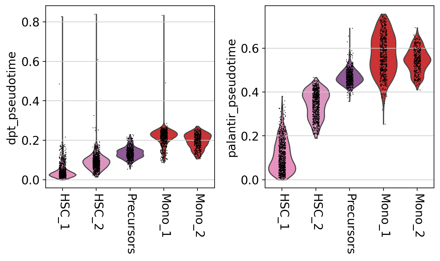
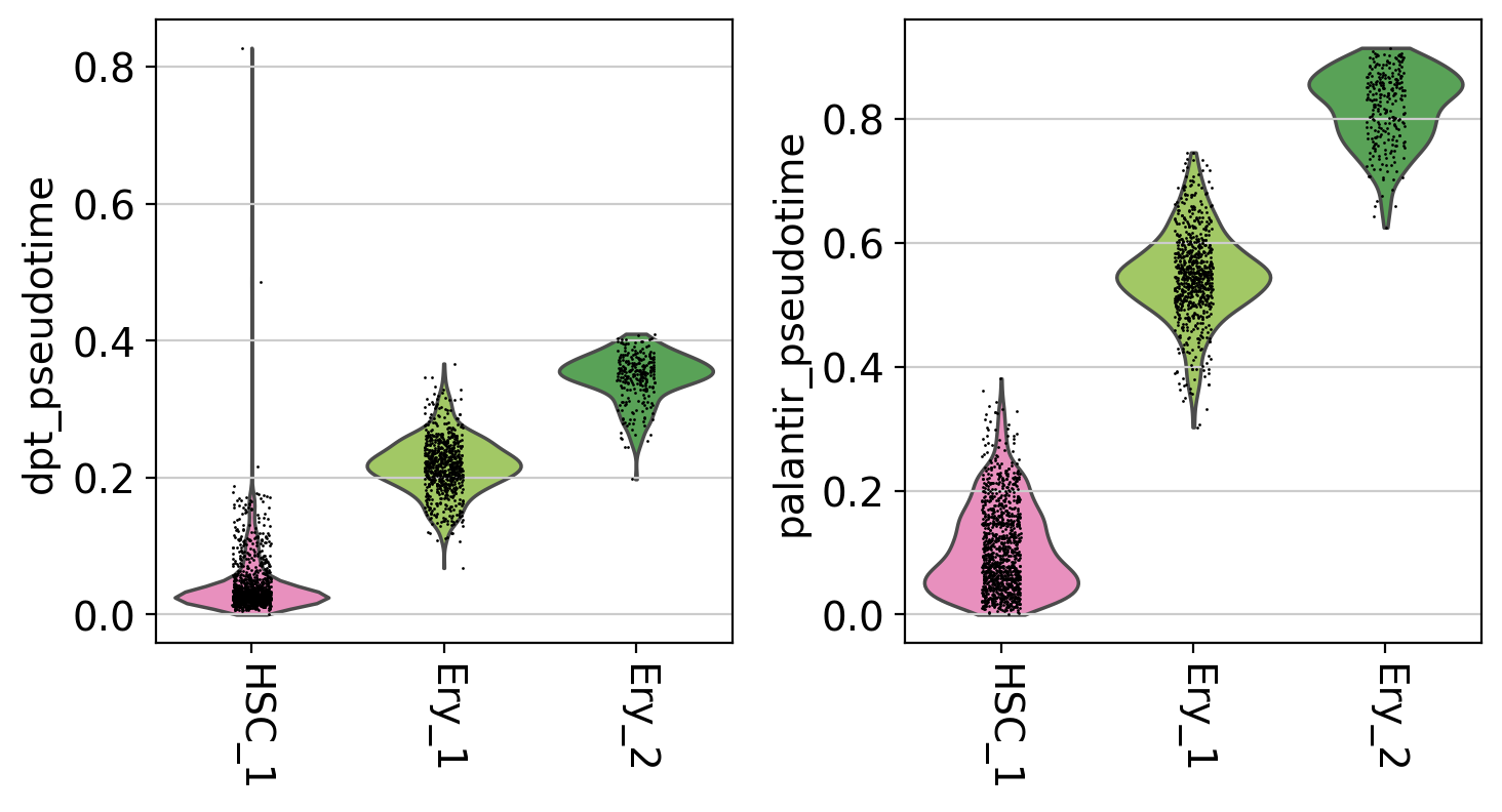
This is a really coarse analysis and only meant to give us a rough idea of which pseudotime to use; generally speaking, they both look good on this dataset. As expected, pseudotimes on average increase as we go towards more mature states. As the Palantir pseudotime appears to be less biased towards CLPs, let’s use that for the PseudotimeKernel below.
Compute a transition matrix
Let’s use the Palantir pseudotime to compute a directed cell-cell transition matrix using the PseudotimeKernel:
pk = cr.kernels.PseudotimeKernel(adata, time_key="palantir_pseudotime")
pk.compute_transition_matrix()

print(pk)
INFO Computing transition matrix based on pseudotime
/cluster/project/treutlein/USERS/mlange/github/cellrank/docs/notebooks/.pixi/envs/default/lib/python3.12/multiprocessing/popen_fork.py:66: DeprecationWarning: This process (pid=564261) is multi-threaded, use of fork() may lead to deadlocks in the child.
  self.pid = os.fork()
INFO         Finish (1.09s)
PseudotimeKernel[n=5780]
We can again visualize this transition matrix via streamlines in the t-SNE embedding.
Note
We do not make use of RNA velocity here, CellRank implements a general way of visualizing k-NN graph-based transition matrices via streamlines in any embedding. Thus, the dynamics in the following plot are purely informed by the pseudotime and the k-NN graph, and not by RNA velocity.
pk.plot_projection(basis="tsne", recompute=True)
INFO     Projecting transition matrix onto 'tsne'
INFO     Adding `adata.obsm['T_fwd_tsne']` (0.54s)
This looks much better, the projected dynamics now agree with what is known from biology.
Note
This is only a low dimensional representation which we shouldn’t trust too much; CellRank contains powerful tools to asses the dynamics in high dimensionional data directly via estimators.
Closing matters
What’s next?
In this tutorial, you learned how to use CellRank to compute a transition matrix using any precomputed pseudotime and how it can be visualized in low dimensions. The real power of CellRank comes in when you use estimators to analyze the transition matrix directly, rather than projecting it. For the next steps, we recommend to:
go through the initial and terminal states tutorial to learn how to use the transition matrix to automatically identify initial and terminal states.
take a look at the
APIto learn about parameter values you can use to adapt these computations to your data.explore the vast amount of pseudotime methods to find the one that works best for your data [Saelens et al., 2019].
Package versions
session_info2.session_info()